In this project we had to develop and produce a product. In this instance we developed a board game. It was split in two parts, the first part was to create a game manuel and the second was to craft the game itself. This project in particular focuses on the manual itself. I had to develop a concise and clear instructions manual. It had to include a brief description, what parts are included in the game, and instructions of play
Board Game Manual
Tools used
Adobe Illustrator
Adobe Photoshop
Updated
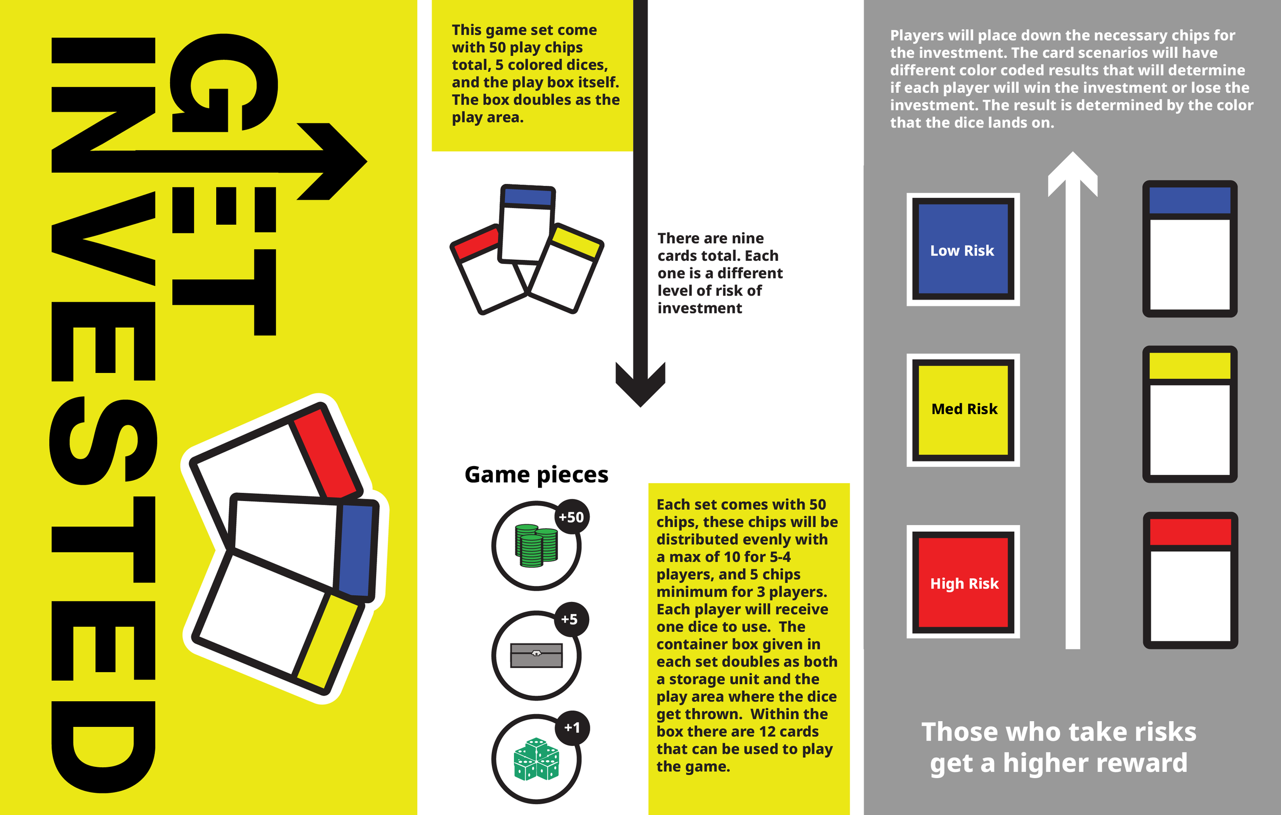
Major changes were done with the original logo. Changes were done to the type to make it all caps through out, and changed the application of the arrow in the logo. A second element brought in were the playing cards from the game. This reworked logo works so much more than the previous one as it could be integrated more into the manual instead of the older version. This Logo sparked the rework of the first draft of the manual.
Objective
What goal I had for this project was to get people to play my game. The Intrest in my game begins with the looking through the game manual. I wanted to capture the viewers attention with a interesting logo and easy to follow through lines in to get people start understanding the game. The first thing we needed to create was a logo. It went through a few versions of the design. But ultimately I came up with this design. Most significant iconography is was would be the the arrow growing through the type, which signified the rise and fall of stocks. This version was used in the first iteration of the game manual and was also the reason why I made a newer version.
First Iteration
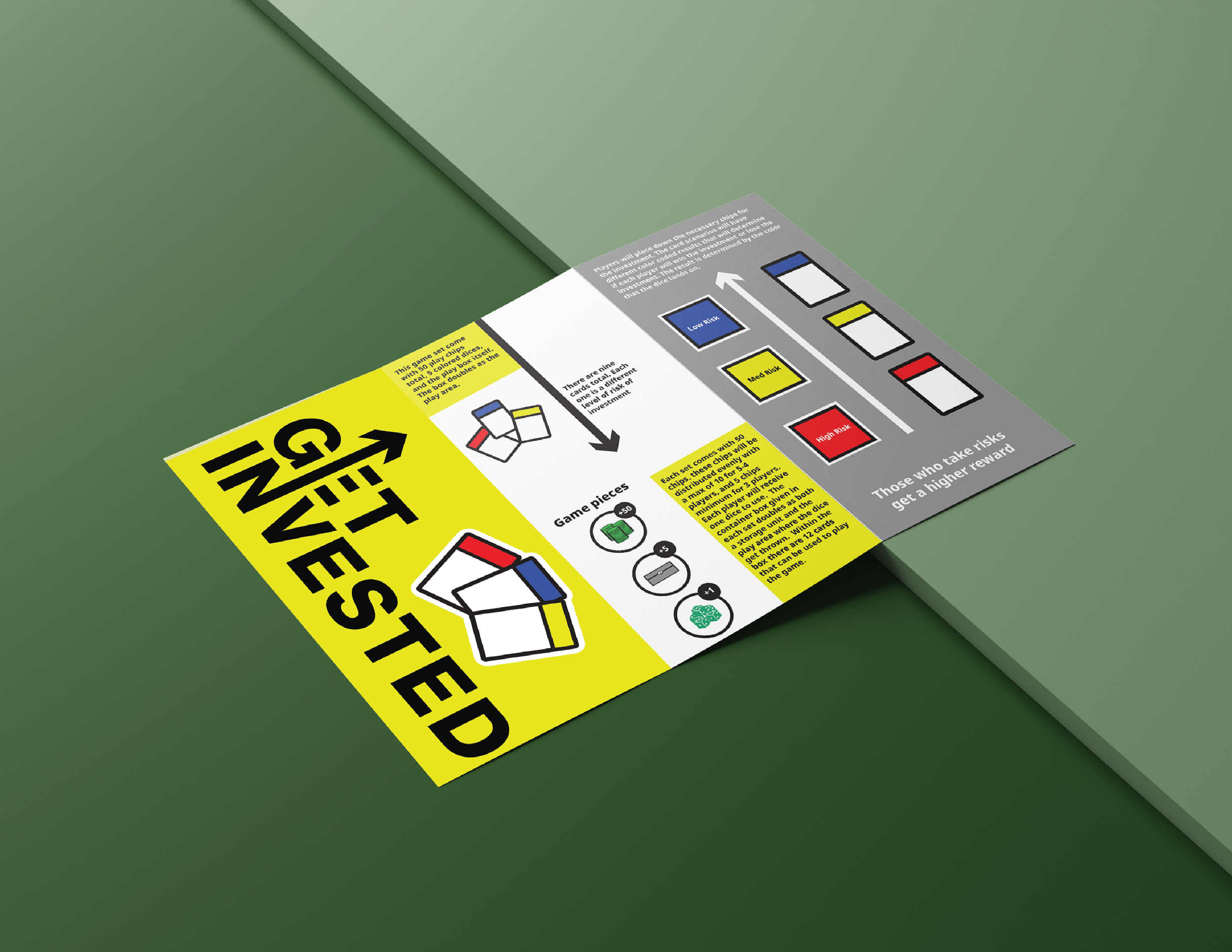
This was the first draft of the manual. My logic behind this version was to focus on the information of the game and since this was to be folded up in a quad fold, there were no divider lines for the columns here. I wanted this version in particular to be minimalistic and limited the amount of vairity in each space. I felt that there was just nothing about this version that felt like it was a game. A few elements were obviously game related but it still felt dry and not fun. Therefore I went back to the drawing board starting with a new logo that helped in creating the next Iteration.
Back Page
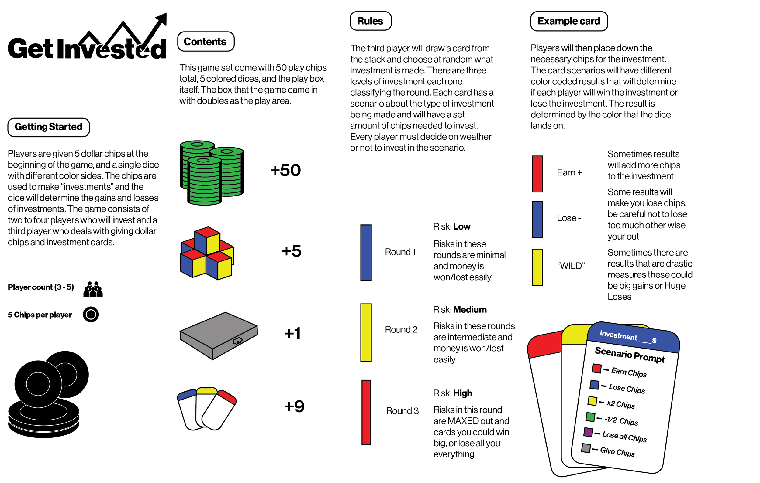
This is the next iteration, not only does it become more direct with logo and uses it as the front page, I also decide have the manual to contain information on the front and back pages. In the second page, a really basic overview of the game itself is provided. It gives information about how many pieces come with the game. The following page broke down what the cards look like and what the colors mean. It doesn’t directly tell the reader how to play, but it does notify what the game pieces look like.
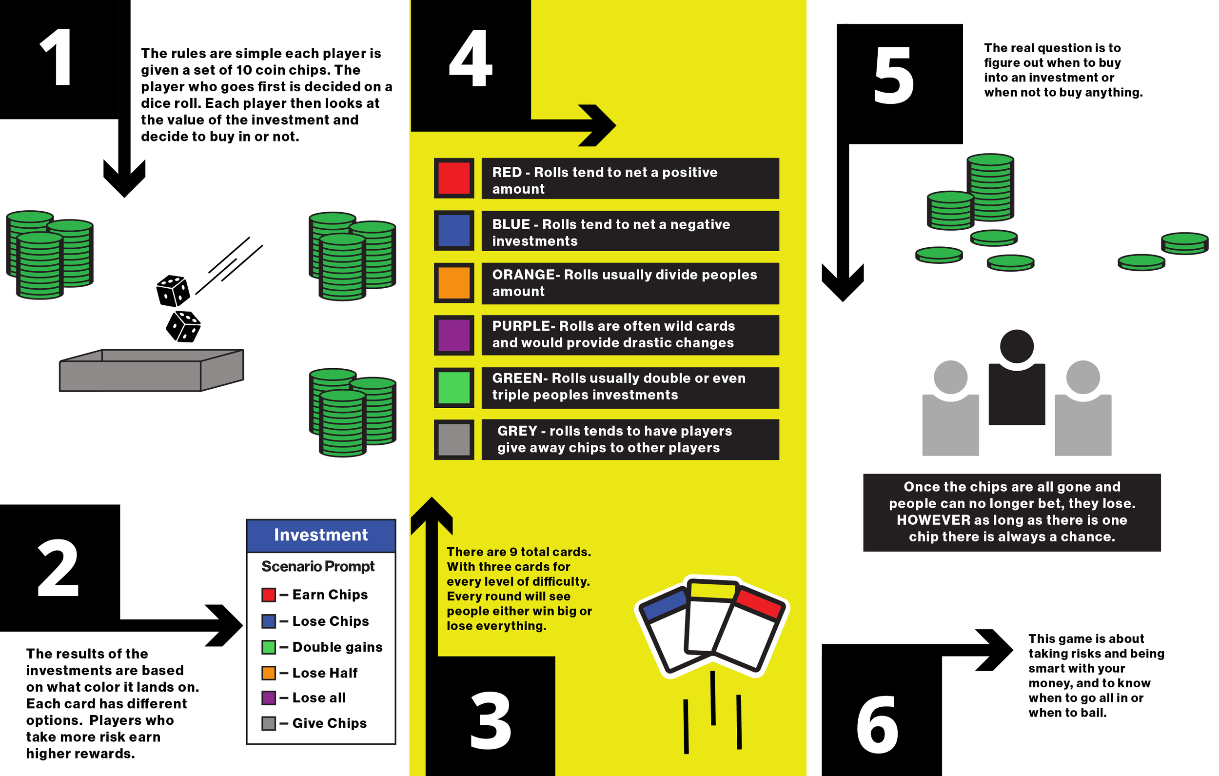
Upon turning to the pamphlet to the back we got a load more information. This is the solution I came up with on how to teach the players to play the game. Using the bold numbered boxes and using the arrows to direct the people through the steps of the game and a more in depth guide on the inner workings of the game. On top of that but more visual elements were added to help people understand the play to support the text.
Refined Manual